Posts

Final Portfolio

Image
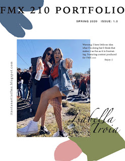
  As my final blog post, I am publishing a complete portfolio. This is a collection of all my works from FMX 210. I will always look back on my time in this class as a time of self-discovery and self-improvement. I became more tenacious, patient, and better at problem-solving.       The portfolio still incorporates fun yet subtle colors that I think incorporate into all of my pieces well.  The shapes in the background of each page were designed to draw the viewer's eye to the work. At first, I was concerned that I'd make it too busy, but I'm happy with the way that I was able to maintain my colors and focus on the works being showcased. Throughout the semester, I have been immensely inspired by color, words, and my past relationships. I am very passionate about taking those inspirations with me to future projects I intend to complete outside of this class with the new skills I have obtained     It was a difficult semester, with COVID-19 preve...

Business Cards

Image
      I found InDesign rather easy to use and it gives the creator so much freedom. During this process, I realized how important color choice is early on because you have to stick to the colors you initially chose when developing your logo. Companies don't often change their logos let alone their brand colors, because it risks losing consumers.  Not every aspect of all the cards turned out as I had hoped or planned in my sketches. This may be due to my misunderstanding of the assignment. I didn't realize we couldn't change our logo or rather only use part of it. This goes back to what I mentioned before about the importance of sticking to a design and having to work around it.  My favorite card in the photography one (middle one). I think the colors have good opposition but also compliment one another well. It is much harder than I thought to make a "personal business card" because you are trying to encompass a person rather than a company.  I enjoyed this...

InDesign Tutorials

Image
 Video #1     This video was a great intro to InDesign because I had never heard of it prior to this class. InDesign is software used developed to make products such as business cards or brochures so it's somewhat similar to Microsoft's Publisher. However, InDesign is much more developed now in that it can create interactive documents and is more flexible to the artist's choices, such as placement or shapes. This video is from 2014 so the on-screen content was of a dated version of the software.  Video #2      This video was made in 2020 so the content is much more accurate to what my experience will be like. This tutorial focused on the use of pages and layers which I think will be very helpful for when I am creating my portfolio. I learned about master pages and that all elements added to it will then be copied onto the following pages. Also saw how to add guidelines in the form of a grid to have a better understanding of how I want to lay elements i...

Autoscopy

Image
  Final Product Layers Autoscopy is the  images of one's own body or one's face within space, either from an internal point of view, as in a mirror, or from an external point of view. I chose for mine to be an external point of view of what I am striving for. I recently came to the conclusion that I have a hard time relaxing, which is new because I used to be a really laid-back person. Since starting college though I've held myself to a much higher standard and am told I am too hard on myself. This may be because I am in such a close-knit community where I can easily compare so much about myself to others. I recently made a promise to myself to not be so uptight and be nicer to myself and this came from the encouragement of my best friend, Grace, who is the other person in my autoscopy. As a matter of fact, this past Saturday she and I got matching tattoos of the smiley face (as pictured above). Mostly because that is the dorm we lived in freshman year when we met, Smiley H...

Black and White to Color

Image
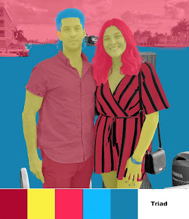
  This is a photo of my brother and me. I enjoyed this project because I was able to explore photoshop so much more and I learned how to do things that I may even use for my own creations outside of the classroom. I feel if I had a different picture I could have done something similar to Andy Warhol's Marilyn Monroe portrait, especially with the Double Split Complementary palette. The vivid colors give it a pop art feel. The first attempt is the bottom image and I used muted colors which make it seem almost unintentional. For each of the three versions, my favorite element to color was my romper because I think against the black stripes the other color stands out and catches the eye.  If I were to do this project again I would choose a different image, one with fewer elements, so that the colors could be more vivid and not as transparent. I would also like to incorporate more black elements in the original picture. I know this because I like the way my black purse looks agains...

Logo Tag Brush

Image
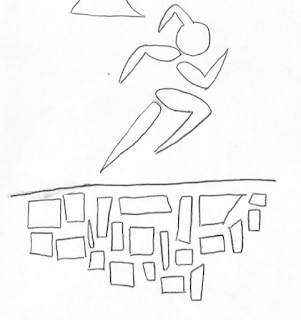
    My logos designed is constructed to be dynamic and represent growth. The blocks are building off one another signifying each step on one's path all lead and contribute to what one becomes and does.  The words I used to describe myself in the process of creating this logo were dedicated, athletic, and hardworking. The figure symbolizes me always moving forward and challenging myself.    My goal for adding the layers was to make the figure look to be surrounded by chaos. I think the scratches, negative, and spray layers make the figure look battered but also experienced. 

Photoshop CC Tutorials

Image
            LEARN PHOTOSHOP IN 5 MINUETS                   BY: FLOW STUDIO       HOW TO USE PHOTOSHOP-A BEGINNERS GUIDE BY: HOWFINITY          LAYERS FOR BEGINNERS BY: PIXEL & BRACKET  

Propoganda Poster

Image
My propaganda poster is in support of women's empowerment. I got inspiration from the cheesy self-love posters often seen in classrooms or at a home goods store as well as the classic propaganda poster of Rosie the Riveter. The word "can" has a lot of meaning but many of us will find ourselves using the word "can't" a lot more often. When I was growing up it was my favorite word according to my mom. If you believe that you can't then you never will. An increasingly popular method of self-love is the use of affirmations, the practice of positive thinking, and self-empowerment. The text behind the image of myself is affirmations. Each phrase affirms my ability and the possibility of doing what I set out to achieve.  I put magnolias all over the right panel of the poster as this flower is often connected to strong and preserving women. A great example of this used in media is the movie “Steel Magnolias” from (1989) or the more recent Netflix series “Sweet M...

Logo

Image
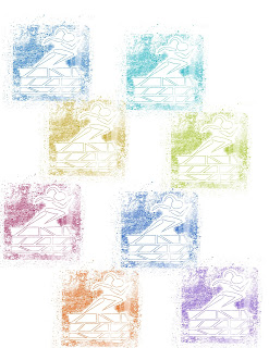
                            My logos designed is constructed to be dynamic and represent growth. The blocks are building off one another signifying each step on one's path all lead and contribute to what one becomes and does.  The words I used to describe myself in the process of creating this logo were dedicated, athletic, and hardworking. The figure symbolizes me always moving forward and challenging myself. My decisions on colors to implement in my logo were based on the basic complementation pallets so often used in movie posters or on big advertising. Blue and orange are often used for action or suspense films, so I thought this translated to the idea of being a competitor or being on a mission. Yellow and purple, or in this case red, are often used in independent films so this relates to me being my own brand and the brightness contributes a youthful tone. The grey/blue design was more personal, in that blu...

Caligram

Image
This Calligram is inspired by a tattoo I have always wanted to get. The dove reminds me of my paternal grandmother who passed away when I was 9. I have always felt a deep connection to her. She was one of the strongest women I have known and I know this not only from my memories of her but from the impression she left on other people. I strive to be like her, always fighting, always caring, always graceful, and always admired.  I created this calligram in Adobe Illustrator using mostly the pen tool and then adjusted the lines and added curves using the direct selection tool. I know what I have created is very simple but that has always been a preference for me.  Dear future me, You spent your whole childhood yearning to be an adult, impatiently waiting for maturity, respect, and validation you so desperately sought. Now that you’re an adult, all you want is the sweetly uninhibited moments of play and lack of responsibility that childhood granted you. Life isn’t a sprint, it’s ...

Illustrator Tutorials for beginners

Image
Video 1      This video was very fast pace but was easy to follow along with and gave a clear and concise overview of the use for each tool in the Illustrator sidebar.  This video shows how to use the most common tools and functions to create vector art. Due to how simplistic this video was none of the tools seemed particularly difficult to use. Rather a challenge will probably present itself in remembering what each tool is designated for. the pen tool seems like the most useful and fun tool to use because it allows you to create custom shapes that are easily manipulated. I also appreciated the narrator mentioning the keyboard shortcuts to many tools including the direct selection tool which allows you to manipulate any specific point of a shape. Video 2 This video was strictly focused on how to use the Pen tool on Illustrator. The narrator was very detailed and used real examples of her work to show how the tool can be used for designing and editing. She elaborated...

Blu Skies

Image
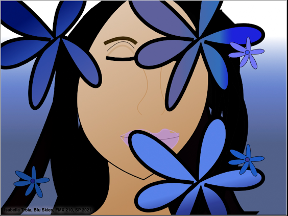
“Blu Skies” is inspired by the emphasis recently placed on mental health. This piece is a representation of how life can be a whirlwind of emotions that is not easily navigated and one can become overwhelmed by these conflicting thoughts. I chose the color blue as the main color of this piece because people have different interpretations of the connotation of blue. Some people see it as sadness while others identify the color with peace. In the same way that each individual interprets blue in their own way, each individual interprets and handles emotions in their own way. In both cases, I believe there is no right answer and that the key to successfully navigating through life’s rollercoaster of emotions is empathy. I wanted to encourage self-reflection in the viewer on their own and others' emotions.  The subject in this piece is slightly smiling to show the audience that despite the chaos of life, the flowers, there is beauty that lies throughout. This project was difficult for m...