Black and White to Color
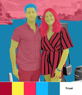
This is a photo of my brother and me. I enjoyed this project because I was able to explore photoshop so much more and I learned how to do things that I may even use for my own creations outside of the classroom. I feel if I had a different picture I could have done something similar to Andy Warhol's Marilyn Monroe portrait, especially with the Double Split Complementary palette. The vivid colors give it a pop art feel. The first attempt is the bottom image and I used muted colors which make it seem almost unintentional. For each of the three versions, my favorite element to color was my romper because I think against the black stripes the other color stands out and catches the eye.
If I were to do this project again I would choose a different image, one with fewer elements, so that the colors could be more vivid and not as transparent. I would also like to incorporate more black elements in the original picture. I know this because I like the way my black purse looks against the solid color mask. It reminds me of when movies are produced with live-action and cartoon aspects, such as Space Jam or Mary Poppins.


I really enjoyed the first edit on the photo! The color palette works well :)
ReplyDeleteI like the color combinations you chose. I think the clouds look really cool in the last piece, especially with the more muted colors.
ReplyDelete