Posts

Final Portfolio

Image
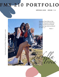
  As my final blog post, I am publishing a complete portfolio. This is a collection of all my works from FMX 210. I will always look back on my time in this class as a time of self-discovery and self-improvement. I became more tenacious, patient, and better at problem-solving.       The portfolio still incorporates fun yet subtle colors that I think incorporate into all of my pieces well.  The shapes in the background of each page were designed to draw the viewer's eye to the work. At first, I was concerned that I'd make it too busy, but I'm happy with the way that I was able to maintain my colors and focus on the works being showcased. Throughout the semester, I have been immensely inspired by color, words, and my past relationships. I am very passionate about taking those inspirations with me to future projects I intend to complete outside of this class with the new skills I have obtained     It was a difficult semester, with COVID-19 preventing us from having face-to-fac

Business Cards

Image
      I found InDesign rather easy to use and it gives the creator so much freedom. During this process, I realized how important color choice is early on because you have to stick to the colors you initially chose when developing your logo. Companies don't often change their logos let alone their brand colors, because it risks losing consumers.  Not every aspect of all the cards turned out as I had hoped or planned in my sketches. This may be due to my misunderstanding of the assignment. I didn't realize we couldn't change our logo or rather only use part of it. This goes back to what I mentioned before about the importance of sticking to a design and having to work around it.  My favorite card in the photography one (middle one). I think the colors have good opposition but also compliment one another well. It is much harder than I thought to make a "personal business card" because you are trying to encompass a person rather than a company.  I enjoyed this projec

InDesign Tutorials

Image
 Video #1     This video was a great intro to InDesign because I had never heard of it prior to this class. InDesign is software used developed to make products such as business cards or brochures so it's somewhat similar to Microsoft's Publisher. However, InDesign is much more developed now in that it can create interactive documents and is more flexible to the artist's choices, such as placement or shapes. This video is from 2014 so the on-screen content was of a dated version of the software.  Video #2      This video was made in 2020 so the content is much more accurate to what my experience will be like. This tutorial focused on the use of pages and layers which I think will be very helpful for when I am creating my portfolio. I learned about master pages and that all elements added to it will then be copied onto the following pages. Also saw how to add guidelines in the form of a grid to have a better understanding of how I want to lay elements into the design. Some s

Autoscopy

Image
  Final Product Layers Autoscopy is the  images of one's own body or one's face within space, either from an internal point of view, as in a mirror, or from an external point of view. I chose for mine to be an external point of view of what I am striving for. I recently came to the conclusion that I have a hard time relaxing, which is new because I used to be a really laid-back person. Since starting college though I've held myself to a much higher standard and am told I am too hard on myself. This may be because I am in such a close-knit community where I can easily compare so much about myself to others. I recently made a promise to myself to not be so uptight and be nicer to myself and this came from the encouragement of my best friend, Grace, who is the other person in my autoscopy. As a matter of fact, this past Saturday she and I got matching tattoos of the smiley face (as pictured above). Mostly because that is the dorm we lived in freshman year when we met, Smiley H

Black and White to Color

Image
  This is a photo of my brother and me. I enjoyed this project because I was able to explore photoshop so much more and I learned how to do things that I may even use for my own creations outside of the classroom. I feel if I had a different picture I could have done something similar to Andy Warhol's Marilyn Monroe portrait, especially with the Double Split Complementary palette. The vivid colors give it a pop art feel. The first attempt is the bottom image and I used muted colors which make it seem almost unintentional. For each of the three versions, my favorite element to color was my romper because I think against the black stripes the other color stands out and catches the eye.  If I were to do this project again I would choose a different image, one with fewer elements, so that the colors could be more vivid and not as transparent. I would also like to incorporate more black elements in the original picture. I know this because I like the way my black purse looks against the

Logo Tag Brush

Image
    My logos designed is constructed to be dynamic and represent growth. The blocks are building off one another signifying each step on one's path all lead and contribute to what one becomes and does.  The words I used to describe myself in the process of creating this logo were dedicated, athletic, and hardworking. The figure symbolizes me always moving forward and challenging myself.    My goal for adding the layers was to make the figure look to be surrounded by chaos. I think the scratches, negative, and spray layers make the figure look battered but also experienced. 

Photoshop CC Tutorials

Image
            LEARN PHOTOSHOP IN 5 MINUETS                   BY: FLOW STUDIO       HOW TO USE PHOTOSHOP-A BEGINNERS GUIDE BY: HOWFINITY          LAYERS FOR BEGINNERS BY: PIXEL & BRACKET