Logo


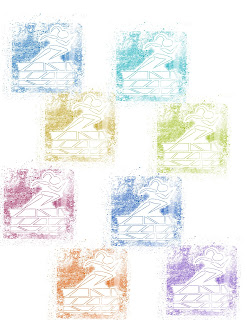
My logos designed is constructed to be dynamic and represent growth. The blocks are building off one another signifying each step on one's path all lead and contribute to what one becomes and does. The words I used to describe myself in the process of creating this logo were dedicated, athletic, and hardworking. The figure symbolizes me always moving forward and challenging myself. My decisions on colors to implement in my logo were based on the basic complementation pallets so often used in movie posters or on big advertising. Blue and orange are often used for action or suspense films, so I thought this translated to the idea of being a competitor or being on a mission. Yellow and purple, or in this case red, are often used in independent films so this relates to me being my own brand and the brightness contributes a youthful tone. The grey/blue design was more personal, in that blue is my favorite color and I have a keenness for muted colors and monochromatic palettes.
I don’t know exactly what career I see myself in, but I know I want to be in a field that allows me to develop a client base I feel that this logo sends the correct message to the public. As the viewer’s eyes move up the design the tone gets lighter and I feel that translates well to success. I went to project to potential clients to envision themselves working with me and reaching their successes and triumph all challenges. If I were to use this in a professional capacity I would change the running figure to have no ponytail so males do not feel excluded. For the purposes of this assignment, I wanted to make the logo as personal as possible so I opted for a female figure.

Comments
Post a Comment