Logo

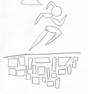
My logos designed is constructed to be dynamic and represent growth. The blocks are building off one another signifying each step on one's path all lead and contribute to what one becomes and does. The words I used to describe myself in the process of creating this logo were dedicated, athletic, and hardworking. The figure symbolizes me always moving forward and challenging myself. My decisions on colors to implement in my logo were based on the basic complementation pallets so often used in movie posters or on big advertising. Blue and orange are often used for action or suspense films, so I thought this translated to the idea of being a competitor or being on a mission. Yellow and purple, or in this case red, are often used in independent films so this relates to me being my own brand and the brightness contributes a youthful tone. The grey/blue design was more personal, in that blu...
